Owner messages revamp
The annual message from the owner has long been a quirky feature of Basketball GM. Each season, you'd get some strange message from the owner about your progress. By reading it, you could figure out how close you were to getting fired.
There were problems though. The messages got repetitive if you played a lot. Sometimes the messages were confusing and possibly buggy, like if you win the title and the owner is still not happy with how much you're winning.
Also the messages were often racist, sexist, or otherwise offensive. In my defense, those were all paraphrases of things our wonderful real life pro sports owners have said. But I don't think everyone got the joke.
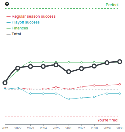
Overall, it was not a great system. Finally, I have replaced it. Instead of the long old messages, you get a short message containing your overall performance, your performance in the past year, and a quick recommendation for next year. Also, you get a chart of your past performance, which looks like this:
I know, there's a lot going on here! I am worried it's too complicated! Please give me your feedback about that, nothing is set in stone. That little info bubble in the top left will hopefully help people understand it. But I'll explain here too.
The owner rates you based on three things: regular season success, playoff success, and finances. He has a numeric score for each of those things. After each season, the scores are updated based on your performance that season.
Then, the total score is simply the sum of the three individual scores. If the total score ever falls below -1, you're fired. So what you see in the chart above is a team that is profitable, but mediocre in terms of performance.
Also, each score is capped at 1, to prevent you from completely ignoring one aspect of the game. For instance, if you win a title every year, your regular season and playoff success scores will be great... but after a few seasons they'll hit 1 and have no room to improve. But if you lose enough money, your finances score can drop to -3 and you can get fired even while winning every year. In the chart shown here, the opposite case is more of a worry - the finances score is already at 1 and can't go higher, so if the team starts losing, all that extra money made will not save me from being fired!
This is how it's always worked! I'm not changing the "owner mood" system. I'm just making it more transparent by showing you the scores, along with their trajectories.
Sure there may be some realism in an owner with somewhat unclear decision-making... but is that actually fun, to have to guess at things like that? Probably not.
Another old thing that you'll now notice is that you get a two year grace period after starting with a new team. The owner won't judge you until your third year. Again, this is always how it's worked, it's just going to be obvious now.
Still with me? If so, you get to read about some of the technical details behind the chart.
The chart is rendered in client side JavaScript. There are a ton of JavaScript charting libraries, and in my experience they all suck. Whenever I have something new to do I'll pick up a new one and try it, and I'm always disappointed.
For this chart, I tried Recharts because it seemed like a popular option for a React-based web app like BBGM. And I did get it working. The Recharts API didn't thrill me... some things felt inconsistent, limited, and not that well documented. But it worked.
Then I checked what it did to my bundle size (the amount of JavaScript you need to load to play BBGM) and oh crap, it went up by 25%! One tiny little chart is equal to 25% of an entire video game? Oh hell no. And that was even after I cherry picked imports, it was worse just naively importing the whole module.
I took to Google to try to figure out if I was doing something wrong, but I didn't find anything. I did notice that the Recharts developers don't seem to have a very high priority on bundle size. I shouldn't be too critical though. Building a good chart library is really fucking hard. That's why there are so many bad ones. And it's not like I could do better.
But for this one specific chart, I can! Making a generalizable API for all kinds of charts is hard. Making one specific chart... not that hard. I used D3 and the code is a bit longer and uglier, but the included libraries are much smaller. And some things (such as using CSS variables for line colors) was actually easier with D3 than Recharts. After cherry picking my D3 imports too, the end result was just an 8% increase in bundle size. That's still quite a bit, but I like the chart :)